Picture this: every element in your presentation is a brushstroke in a larger painting. Every chart, every graph, and every image tells part of a story. So, what is the best way to use visuals effectively in a presentation? The answer lies in choosing visuals that speak. Visuals must not overwhelm. They must not dilute your message. Instead, they should be powerful allies in your storytelling arsenal, clarifying, emphasizing, and engaging.
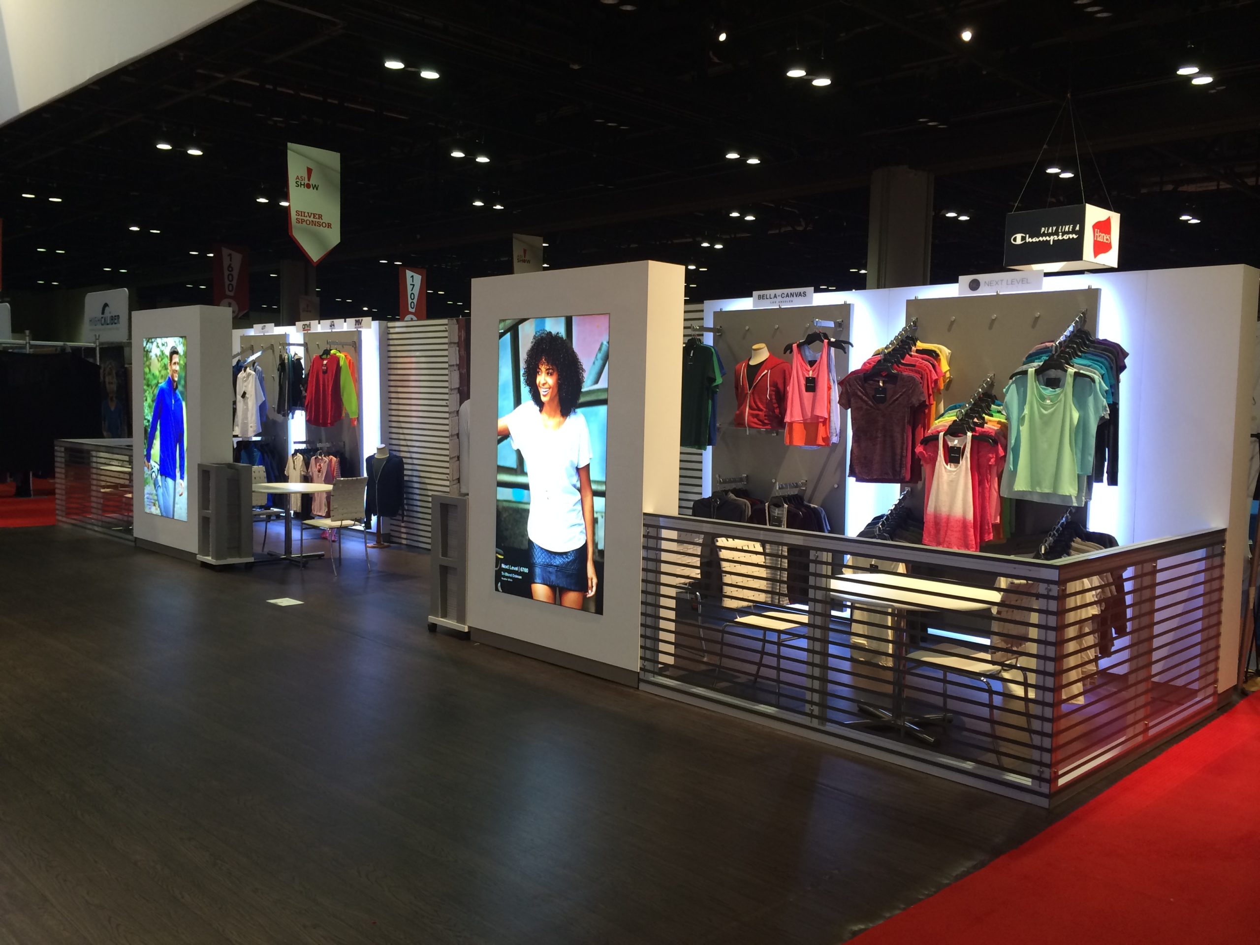
A stage is a canvas, and stage branding is how Multi Image Group (MIG) paints your brand’s mission with broad, vivid strokes. The stage sets the scene for a narrative where your brand is the protagonist. Our designs don't just fill a space; they create a sensory experience that marks the memories of the audience. MIG unites form with function, ensuring that every visual element aligns with your messaging, creating a cohesive, impactful, and visually stunning representation of your brand.
Tailoring Visual Aids to Complement Your Message
Visuals should not overpower your message but underline it. Every image, graph, or video clip included must serve a purpose, directly reinforcing the point you're making. If your presentation is about market growth, for example, a well-designed graph can make your point clearer than words alone. Choose visuals that mirror your topic, making complex information digestible and engaging.
Effective visuals also account for your audience's expectations and needs. A financial report presentation demands detailed graphs, whereas a product launch might benefit from bold images and immersive videos. By aligning visuals with both the message and the audience, you make your presentation more relevant and impactful.
Engaging Your Audience with Interactive Elements
Interactive visuals invite your audience to be part of the presentation. Polls, quizzes, or even simple Q&A sessions can transform passive listeners into active participants. This not only makes your presentation more memorable but also provides immediate feedback on your audience's understanding and engagement.
Technology can be a great ally in making visuals interactive. Tools that allow audience members to submit questions or vote in polls via their smartphones can keep engagement high without interrupting the flow of your presentation. Remember, the goal is to stimulate interaction that enriches the experience, not to distract.
Maintaining Simplicity to Enhance Focus and Retention
Less is often more with visual aids. Crowded slides, overly complex graphs, or flashing animations can distract more than they enlighten. Aim for simplicity to ensure your visuals enhance focus and help the audience retain information. A single, powerful image or a clean, informative graph often speaks louder than a slide overloaded with data.
This principle extends to text on visuals, too. Keep words on slides to a minimum, and never just read off the slide. Your visuals are there to support what you're saying, not to serve as a script. Striking the right balance between information and simplicity makes your key messages stand out.
Ignite Engagement with Visual Excellence
Live event branding is where your brand's pulse is felt strongest. It's the art of making every visual count, ensuring each moment is an opportunity for connection and engagement. At MIG, we curate your live event environment to resonate with your brand's ethos. We infuse life into your brand story, providing a shared experience that is authentic, unforgettable, and amplified by strategically placed, themed visuals that draw the eye and capture the heart.


